Do you want to create stunning pieces of art, but don't know where to start? Well, you're in luck! In this blog post, we will discuss how to use color theory in your artwork. Color theory is a topic that is often overlooked by artists, but it can be extremely helpful in creating beautiful pieces. We will go over the basics of color theory and show you how to apply it to your own work. So what are you waiting for? Let's get started!
How to Use Color Theory in Your Art to Create Stunning Pieces
Whether you're a beginner or a pro, understanding color theory can help you create beautiful works of art. By using the right colors, you can add depth and interest to your paintings, illustrations, and sketches. Here's a quick guide to using color theory in your art.
What is color theory and how can it be used in art to create stunning pieces?
Color theory is the academic and practical study of the effects of colors on visual perception. Color theory can be used to create powerful works of art that reflect the color relationships within a piece. For example, an artist might choose to use contrasting colors or complementary colors as a focal point of the composition to create visual interest and depth.
Color theory also allows artists to use color balance and harmony in their work, helping to control how viewers feel while they experience a work of art. Furthermore, specific colors can evoke an array of emotions depending on their placement in the piece. By using color theory, artists are able to manipulate emotions and tell stories through vibrant palettes and expressive color combinations, producing captivating artwork that stands out from the rest.
The basics of color theory – the color wheel, primary colors, secondary colors, etc.
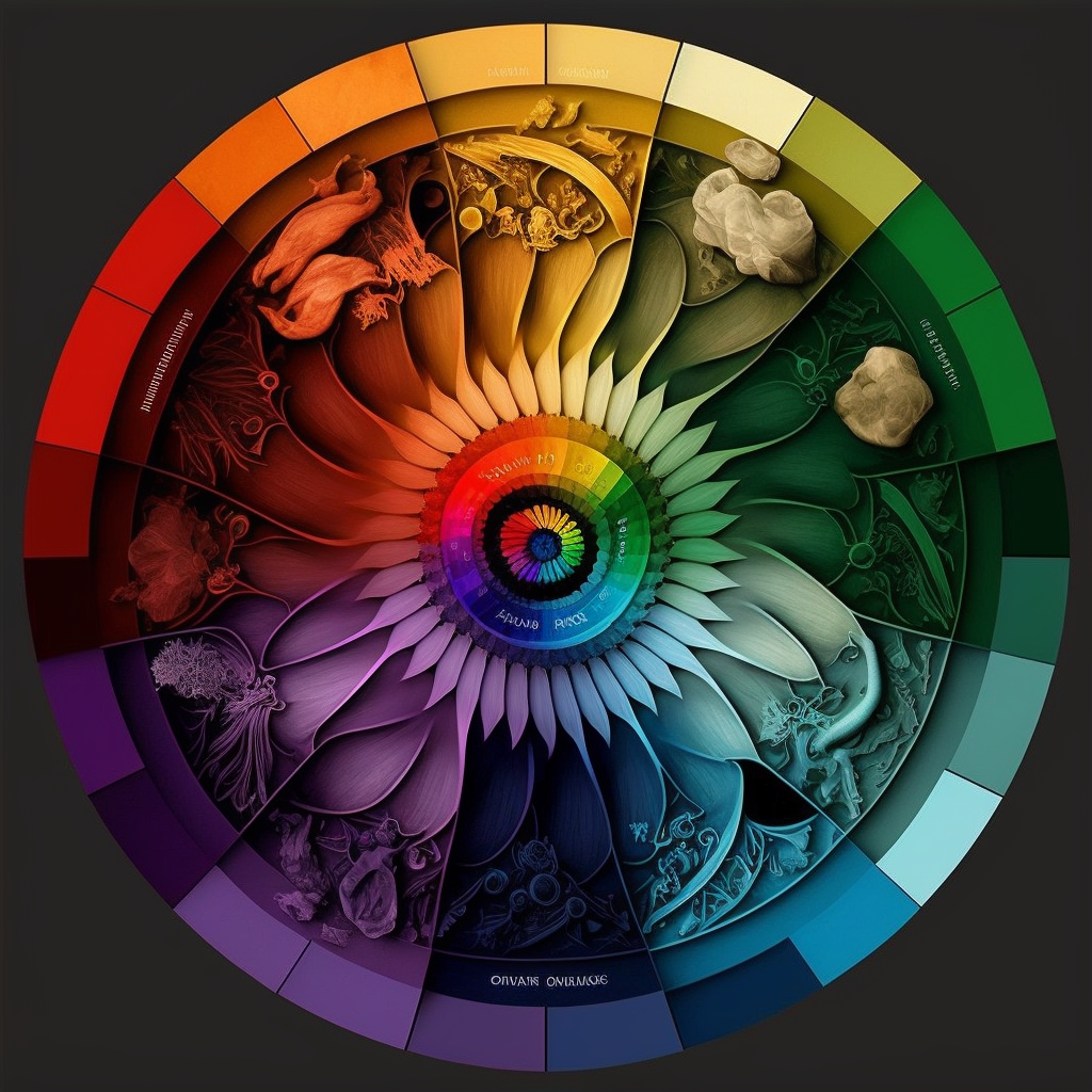
Color theory helps us to understand the building blocks of color and how various colors interact with each other. It all begins with the color wheel, which contains a spectrum of colors based on how they appear when light is split through a prism.
Within the color wheel there are three main categories: primary, secondary, and tertiary colors. Primary colors are red, yellow, and blue and can't be mixed; secondary colors are made by combining two primary colors together; tertiary colors are variations of the primary and secondary colors.
Each color has an emotional state associated with it that can subtly influence viewers when used in visual design. Color theory gives us insight into how these different hues work together to create visual harmony or evoke powerful reactions from those who experience them.
For example, blue and yellow = green. Red and blue = purple. Red and yellow = orange. We learn these mixtures of primary color in grade school, but artists must apply color theory in art to enhance their own color schemes.
What is a color scheme?
A color scheme is a set of colors, be they primary colours, secondary color or tertiary color, or a mix of all three. Certain color schemes have special names:
- An analogous color scheme is when two or more colors that are adjacent to each other on the color wheel are used in a composition. For example, using warm colors like red, yellow, and orange could be an analogous color scheme. Or using cool colors like purple, blue, and green.
- A complementary color scheme is when two colors directly opposite one another on the color wheel are used together. An example of complementary colors is red and green, or blue and orange.
- A monochromatic color scheme is when only one single hue is used throughout a work of art without any additional tints
- A triadic color scheme is when the color combinations that you use are split evenly, into thirds, across the color wheel.
Images and videos explaining the differences between analagous color schemes and other color schemes (split complementary color scheme: what in the heck?) have always confused me. So instead, for you to learn your color schemes, I'm going to recommend a tool.
Paletton is a great color wheel-based tool to use to learn the names and more importantly, the values, of color schemes. You'll be able to easily generate secondary colors, complementary colors, triadic color schemes, and totally new color combinations. Plus – it's completely free. So head over to Paletton and give it a try.
If videos are more your style, consider a SkillShare subscription. They really do have some great resources on the color wheel, and the knowledge you gain will help you with watercolor painting, landscape painting, and even digital art. Get your free trial at Skillshare now!
How to use color theory in your own art to create amazing results
Color theory is an invaluable concept for any artist, regardless of the medium. It allows one to control and enhance the emotions and ideas created by their artwork. By understanding how to mix, complimentary, and contrasting colors, artists can produce expertly balanced pieces that draw in anyone who views them.
For example, a warm pastel color palette of pinks, warm yellows, and light blues are models of how cool and warm tones harmoniously interact to establish a visually pleasing image. Color theory allows one to create works that balance complex aesthetic principles with simple details– making it both accessible yet impactful. Therefore, mastering the application of color theory in your art is essential if you want to make stunning works that stand out from the crowd.
An example of shading with cool colors (and highlighting with warm colors) on the color wheel
A concrete example for me is with shadows and light. If I want to add a shadow to a red shark in my illustration, I need to select cooler colors scheme for that shadowing. I know from colour theory that choosing a red purple would go great because purple is cooler (to the left) than red, but is analogous. Then it's just a matter of selecting the shade.
Similarly, I would select a blue green highlight color for a blue shark because colour theory tells me that green is warmer than blue light. Understanding the color wheel helps me choose the appropriate warm and cool colors for my project.
Some examples of artwork that uses color theory effectively
Color theory is an essential principle of art that has been recognized for centuries. Artists have strived to effectively utilize color theory in their artwork to create a more striking and meaningful visual experience. One great example is the work of Gustav Klimt, a well renowned Austrian Symbolist painter from the early 20th century. By incorporating geometric and curvilinear designs within dynamic color combinations, Klimt achieves his signature style of emotive expression through color.
Another example is the contemporary artist Chiharu Shiota, whose work often draws upon the psychological effects associated with varying hues and tones. Through her use of supernatural palettes and vast installations, her pieces illustrate how powerful an effect color can have on an artwork's narrative. By studying these examples, one can gain insight into the meaningful ways in which color shapes our artistic landscape.
Tips for using color theory in your own artworks
Color theory plays a vital role in art making, helping us understand the relationship between different hues and how to combine them to great effect. To use color effectively in any artwork of your own, start by thinking about your subject matter and what message you want to convey.
Look for ways to create contrast between various colors, as this can help your artwork stand out from others. Consider the shades of light and darker tones, as well as tints and shades of color. Also think about the dominant and subordinate hues present in each painting, as this can greatly influence its impact on viewers. Take time to practice mixing and matching different colors before creating your final piece – that way, you can avoid any unpleasant surprises!
Final thoughts
Color theory is a vital part of art and can be used to create stunning pieces. By understanding the basics of color theory, you can use it in your own art to produce amazing results. Experiment with different combinations of colors and see what effects you can achieve. With a little practice, you'll be able to utilize color theory like a pro!
And remember – if you need more help, Skillshare is a great resource.